Central Park West . New York
Central Park West is one of New York’s most glamorous streets. With spectacular art deco buildings and sweeping views of the park, it conjures grandeur, pedigree, refinement. However, what Roman and Williams saw when they showed up to redesign CPW was anything but.
RS: The first time we saw the place it was charred. There was an unfortunate fire in the apartment—that was the sad part of the story. But that was a very intriguing part of the story for us. It was a sort of Phoenix out of the ashes. The client came to us with the complicated task of rebuilding the bones of the apartment, and then doing the insertion of the design that we wanted to do. On Central Park West you inherit all that all those moldings and all that detail and that was something we had to create. And it was so inspiring to see that blackened shell, which was so dramatic and so spooky. It was like an installation from another time.
SA: It was so gorgeous, like a strange dream. But we had to academically bring it back to its original state, which was not creative, more like an investigation study. We started our project after we did all that, and then we laced in our creative things.
RS: It’s almost like geology. You had this first layer, which was like a completely zero palette, like a forest after a fire. Then we had to look for those seedlings and reconstruct—not from any sort or archeology or photography that we had on the history of the building. We channeled what the apartment was. We started from scratch.
SA: We had nothing and we got to bring it back to what we believed the level it was at.
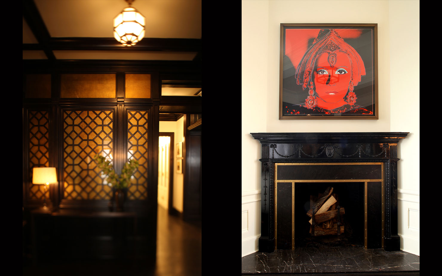
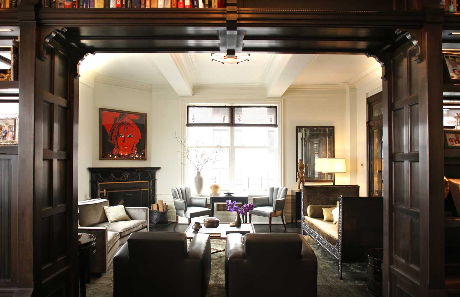
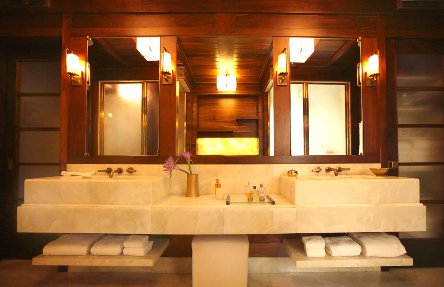
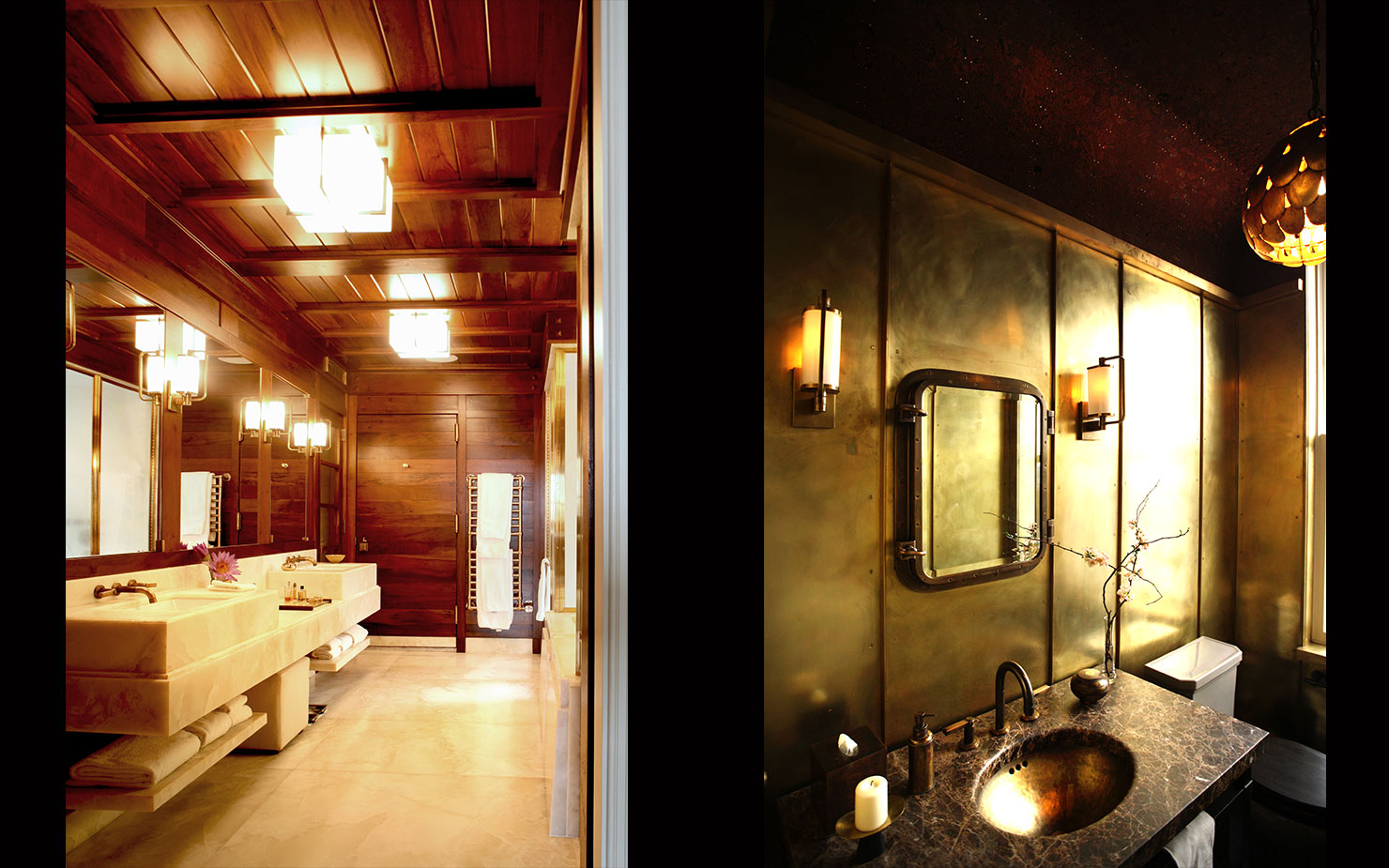
RS: We had no evidence. Our narrative was that we were going to create this frosty beautiful white box, which is typical to upper Manhattan, and then insert this heavy, wooden, Richardsonian feel.
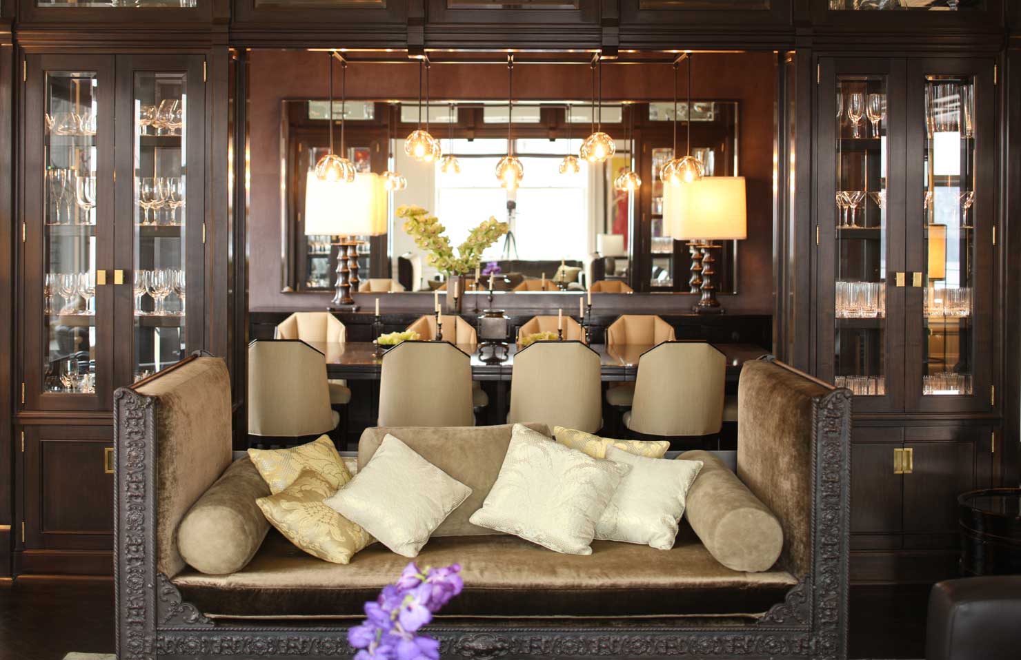
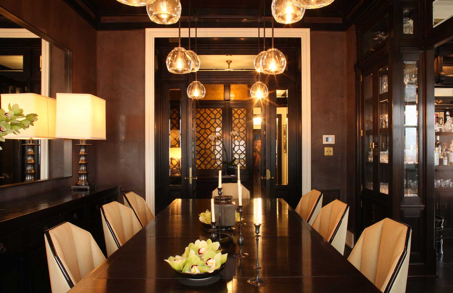
SA: We’ve always loved [Henry Hobson] Richardson. He’s the most heavy-handed guy in the history of earth—the buffaloes, the trophies, the avalanche of millwork. It was expensive to do that kind of work. We drew from our work on Duplex, which had that same heavy-handedness.
RS: We were inspired by the char. It was about palette, it was about contrast, it was about light. There was something so cinematic about that first image, and we didn’t want to let that go, we didn’t want to scrub it. We somehow wanted to get back to that smoky spirit, and I think we did.
